
Conversion Rate Optimization Button Tips
The best-converting website buttons stand out visually, use high-contrast colors, and have
clear, actionable text. Here’s a summary you can easily copy and use:
Button Colors:
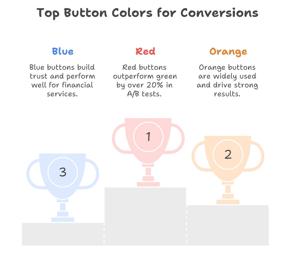
• Red, orange, blue, and green are some of the most effective button colors for
conversions.
• Red buttons can outperform green by over 20% in many A/B tests, especially when
they contrast with the background.
• Orange is widely used (like Amazon’s “Add to Cart” button) and often drives strong
results.
• Blue is known for building trust and performs well for financial or professional services.
• Green is effective, especially for positive actions (“Buy now”, “Submit”), provided it
contrasts with the site.
• The most important factor is choosing a button color that offers strong contrast with
the rest of your webpage.

Button Text:
• Use clear, direct, and action-oriented language. Phrases like “Get Started,” “Buy Now,”
“Try Free,” or “See Plans” typically outperform generic labels.
• Specific CTAs such as “Get my free trial” or “Download the guide” often get much
higher conversion rates.
• Avoid generic, vague labels like “Submit”—descriptive, benefit-driven text performs
much better.
Which CTA should be used to maximize conversion rates?
